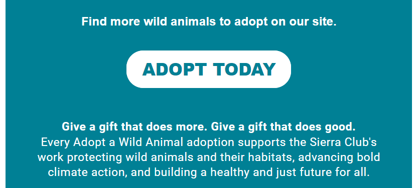
Call to Action Button Text
Experiment No. 005
A Call to Action Call to Action
Read most articles on call to action button text and they say to write two words. These articles also encourage us to use text such as, “Learn More,” “Buy Now,” or “Click Here.”
Last year, according to M+R Benchmarks, the click-through rate for nonprofit email newsletters was 1.7%. For fundraising emails the rate drops to 0.7%.
Is this the best we can do?
Best Practices for Call to Action Text
To improve click-through and conversation rates...
Set Expectations: Is it clear what will happen when the supporter clicks the button? Button text should set the stage for the next experience.
Action Words: Use strong verbs that motivate a supporter to interact. The most common verb for CTA text is “Get.” Used about 10% of the time. The other verbs used were: “Shop,” “Take” and “Read.” Stats taken from a study by Really Good Emails.
Urgency: Create timeliness when appropriate. Don’t use “Now” on every button. That negates urgency.
Copy Before Button: Write copy, in particular the sentence before the button, as a call to action.
Length: This is tricky to navigate. Too long and no one clicks. Too short and no one clicks. We need to find a balance between text length and text description. The average text length is 14 characters. The shortest was 3 and the longest was 66. Yep, these stats came from the same Really Good Emails study.
Description: If the text provides value to a person they will proceed. Make sure to deliver value.

Too often, button text is predictable and uninspiring. When this happens supporters stop interacting.
We focused on writing more descriptive button text to see if it would lead to more clicks. But before making a decision we conducted a test.
Let’s look at the results.

Research Question: Will using more specific call to action text on a button lead to more clicks?
Hypothesis: The email button with specific call to action text will have more unique clicks.
Test Element: Feature button call to action copy
Control- Listen Now
Test- Hear Their Story
Key Metric: Number of unique clicks on feature button
Other Metrics: Number of gross clicks on feature button, click rate for entire email
Sample Size: Used a 50/50 split
Control- 9,486
Test- 9,478
Results: The button with specific text had higher
Unique clicks - 60%
Gross clicks - 64%
Total email click rate - 1%
Application: When writing text for the call to action button, use descriptive text. Generic text, such as, “Listen Now,” “Read More” or “Learn More” is not as effective as text that is more compelling. It not only improved the unique clicks but more supporters came back and clicked on the button again.
Future Tests: A good test will often lead to more questions. This test raised a few. New test ideas include:
Consider using first-person language?
Does length of text matter?
Will adding an arrow after the text improve clicks?
Final Thoughts: Button text is a challenge to get right. The balance between short calls to action and descriptive calls to action is difficult. Too short and the text is ineffective, too long and the text will wrap to more than one line. Forcing your button to look like a square, not a button.